Rotyi Bistro: a menu that gets out of its own way
Small kitchens live on Instagram, but their websites are often a PDF nobody opens. We wanted to see what happens when the website works as hard as the Instagram feed does.
 Rebeka SziliCo-founder5 min read
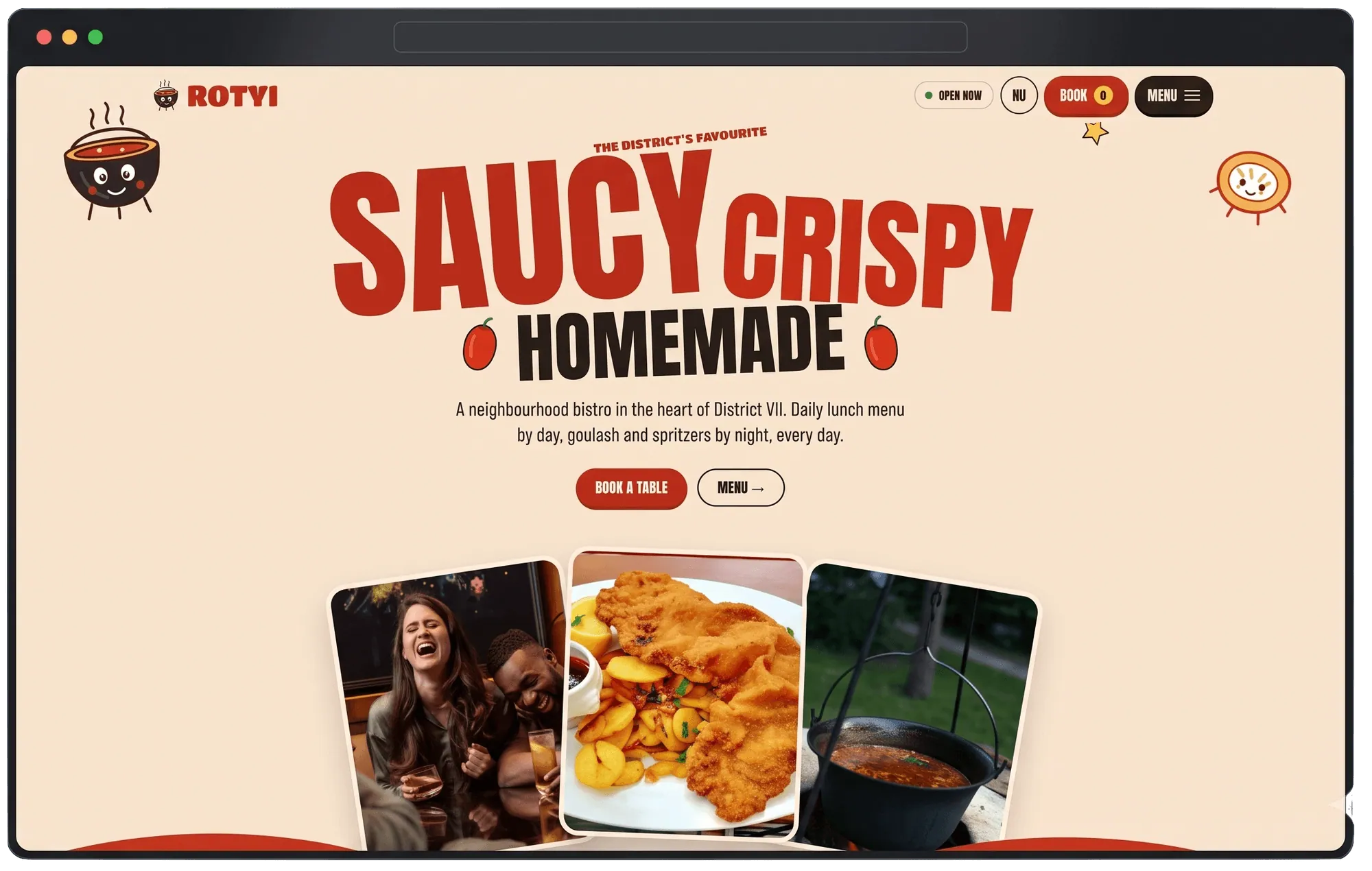
Most of the bistros I talk to don't have a website problem so much as an Instagram-does-all-the-work problem. The feed is full of energy — daily specials, the kitchen in motion, regulars tagging the place. Then you tap the link in bio and land on something that feels like it was built for a completely different, much quieter business. A PDF menu. A contact form nobody fills in. The energy just stops.
Rotyi Bistro, one of our own bistro concepts, was built to test what happens if the website doesn't stop that energy — if it carries the same pace as the Instagram feed, while still doing the one thing Instagram can't: taking a booking.
The real problem with "bold and busy"
Here's the tension: a bistro's whole personality is loud, colorful, a little chaotic in the best way. But a website that's loud and chaotic in the same way usually buries the two things people actually came for — what's on today, and how do I get a table. Bold doesn't have to mean disorganized. That was the whole design problem in one sentence.
What we built
A bold interface that still knows where to put things. Color and energy throughout, but the daily menu and the booking button are never more than a glance away, on every screen size. We didn't tone the personality down to make the site "usable" — we just made sure the loud parts and the functional parts weren't fighting each other.
A daily menu structured to actually get updated. A bistro's lunch offering changes constantly. If updating the site is a chore, it stops happening within a month and the site goes stale while the Instagram feed keeps moving. So the menu section was built specifically to be easy to keep current — prominent, simple to edit, not an afterthought bolted to the bottom of the homepage.
Booking designed for someone standing on a sidewalk, not sitting at a desk. Most of the people reserving a table at a bistro like this are doing it from their phone, mid-walk, deciding in the next ten seconds whether to detour. We optimized the whole flow for that moment specifically, not for a desktop user with time to browse — which in practice meant paying attention to Interaction to Next Paint as much as load time. A page that loads fast but feels sluggish the moment you actually tap something fails that person just as badly as a slow one.
The number that mattered to us
Specials and table booking sit one tap from the menu. Not two, not three — one. That constraint shaped more of the layout than anything else, because it forced every other decision to justify its place: if a section didn't help someone get from "what's good today" to "I have a table," it had to earn a very good reason to exist between those two things.
Why this one felt different to work on
Most of the case notes we write are about getting something complicated right — a booking system, multiple languages, a CMS a non-technical team can actually use. This one was about restraint. React and Tailwind let us move fast and keep the interface colorful without it turning into noise — utility classes instead of a custom CSS file meant the "bold but organized" rule could be enforced consistently across every component, not just the ones we remembered to double-check. Vercel's hosting meant we didn't have to think about whether the site could handle a lunch rush — it just does.
The lesson I'd pass on to any small kitchen thinking about their own site: your Instagram already proves you have energy. Your website's job isn't to prove that again. It's to take the booking before someone scrolls past.
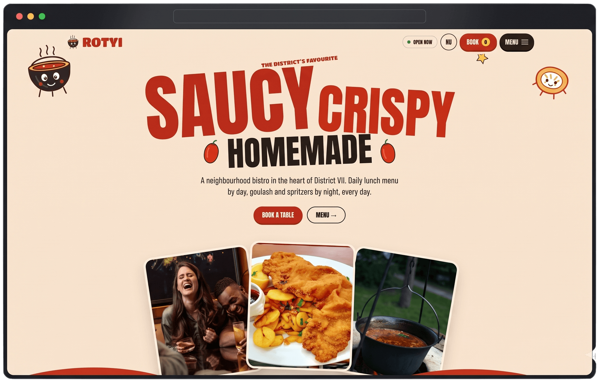
The project behind this post
Rotyi Bistro
Bistro & Restaurant Platform
Questions worth answering directly
- Why does a bistro need a website if all their marketing already happens on Instagram?
- Because Instagram can't take a booking. It's the best channel for proving a place has energy and regulars, but the moment someone's ready to act, they need somewhere that confirms a table — and a flat PDF menu or a dead contact form kills that momentum right when it matters most.
- How often should a restaurant actually update its online menu?
- As often as the kitchen changes it — for a bistro with a daily lunch offering, that means daily, not quarterly. The reason most restaurant sites run stale menus isn't laziness, it's friction: if updating the site takes longer than updating an Instagram story, it stops happening within a month. The fix is building the menu section to be genuinely fast to edit, not just technically possible to edit.
- Should a small bistro's website match its social media personality, or stay more neutral?
- Match it. A website that's calmer and more corporate than the brand's Instagram feed reads as a bait-and-switch — the energy that made someone follow the account in the first place just disappears the moment they land on the site. The goal isn't to tone the personality down for "usability," it's to keep the energy and still make sure the menu and booking button are never more than a glance away.
Also available in Hrvatski · Magyar
Rebeka Szili
Co-founder
Your point of contact from first call to launch, and the person who keeps projects moving once the building starts.
Connect on LinkedInHave a project in mind?
More from the Blog
Case notes
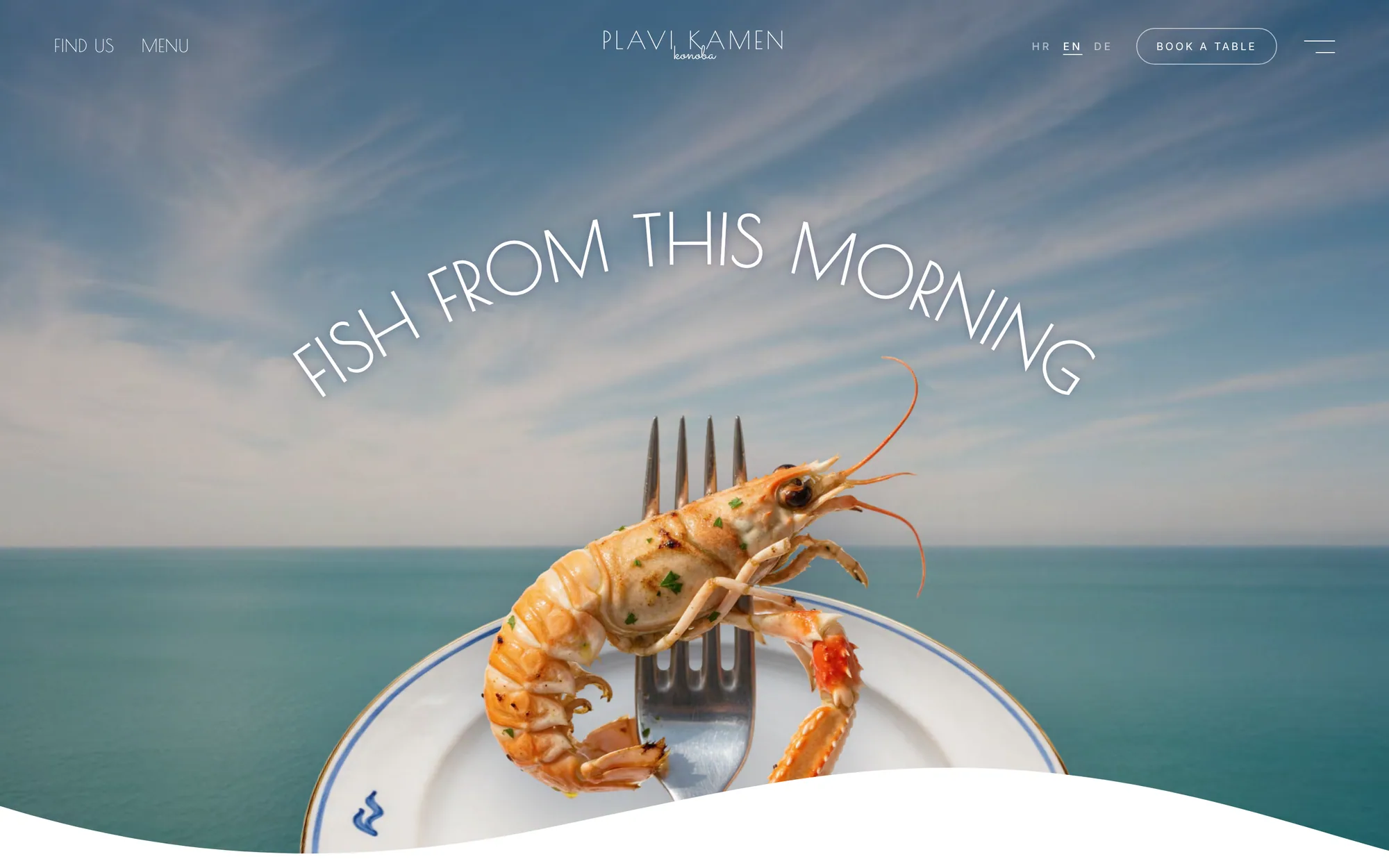
Konoba Plavi Kamen: designing for tourists who haven't arrived yet
Coastal hospitality has a timing problem most restaurant sites ignore — the decision to eat somewhere happens before anyone is in the room. Here's how we built around that.
Oct 14, 2026 · 6 min read
Case notes
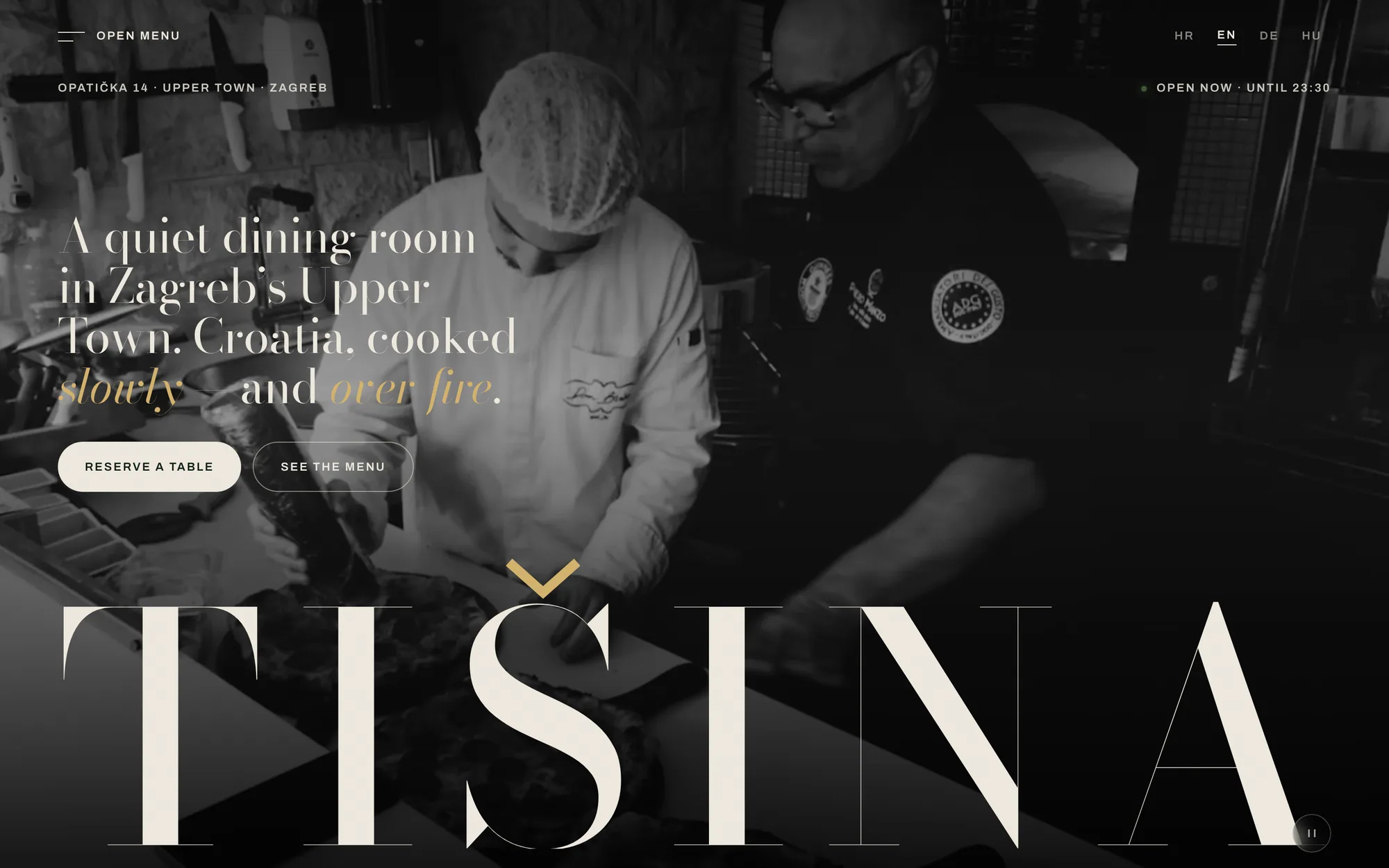
How we built Tišina
A restaurant website lives or dies on one question: does it feel like the room it's describing? Here's how we answered that for a slow-dining concept with 28 seats.
Oct 12, 2026 · 6 min read
Growth
Reading a Search Console Links report without panicking
A sudden list of unfamiliar domains linking to your site looks alarming in Google Search Console. Most of the time it isn't — but you do need to be able to explain every one of them. Here's how we actually read that report.
Oct 20, 2026 · 6 min read