How we built Tišina
A restaurant website lives or dies on one question: does it feel like the room it's describing? Here's how we answered that for a slow-dining concept with 28 seats.
 Kiran RamagiriFounder6 min read
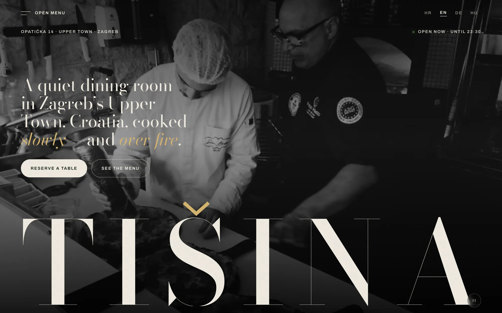
Tišina means "silence" in Croatian. Before we wrote a line of code, that word was the whole brief.
Most restaurant sites solve a narrower problem than they think. They show you hours, a gallery, a PDF menu if you're lucky, and a button that calls the restaurant. That's a fine site for a place that wants you to already know what you're walking into. It's the wrong site for a concept built around pace — where the point is that you're not in a hurry, and neither is the kitchen.
The brief we gave ourselves
Tišina is one of our own concepts: a slow-dining restaurant built around regional ingredients and a dining room that seats 28 people, on purpose. Small enough that every table matters, small enough that the booking flow couldn't just be a generic reservation widget bolted onto a template.
The challenge wasn't technical in the usual sense. It was that "quiet" and "patience" are feelings, not features, and a website has about four seconds to communicate a feeling before someone decides whether to keep scrolling.
What we actually built
The structure is simple on purpose. One scroll, four movements: the room, the food, the people behind it, the table. No navigation maze, because a restaurant website doesn't need an information architecture — it needs a reason to stay on the page for thirty more seconds.
The transitions carry the tone. We built the site on Next.js with Framer Motion specifically because CSS transitions alone couldn't give us the kind of cross-fade pacing we wanted between sections. Most scroll reveals use a linear or ease-out curve because it's the default — we didn't. We hand-tuned a custom cubic-bézier that front-loads the motion and lets it settle slowly, the same shape you'd use for a camera rack-focus, not a UI toast. Slow enough to feel unhurried, fast enough that nobody thinks the page is broken. That distinction sounds small. On a slow-dining site, it's the whole point: if the motion feels rushed, the restaurant feels rushed, and the concept falls apart before anyone reads a word of copy.
The menu is typography, not a PDF. We built an interactive menu focused entirely on type and spacing — no food photography competing for attention, no icons. Seasonal ingredients and regional heritage get to be the content instead of decoration around the content.
Booking is short because the room is small. With 28 seats, there's no reason to make someone click through five screens to request a table. The booking flow is built around that fixed number — not a generic third-party widget that doesn't know or care how big the room actually is.
The decision that mattered most
We put the images on Vercel's edge network deliberately, not as an afterthought. Food photography is the heaviest thing on a restaurant site, and the people most likely to visit — scrolling on their phone, deciding where to eat tonight — are the ones with the least patience for a slow load. Largest Contentful Paint is the metric that actually captures this: it measures when the biggest, most meaningful thing on the screen finishes rendering, and on a restaurant site that's almost always the hero photo, not the headline. A beautiful photo that takes three seconds to appear has already lost — both the visitor and the score. Serving pre-sized WebP from the edge, close to wherever the visitor actually is, is a boring decision. It's also the one most restaurant sites skip, which is exactly why it's the one that matters.
What I'd tell someone building something similar
If your product is a feeling before it's a feature list, don't start with the page structure. Start with the word that describes the feeling, and let every decision — the transition timing, the font weight, how much white space surrounds the menu — answer to that word. "Fast and modern" is what everyone's brief says. It wasn't ours, and the site is better for it.
Tišina is a concept build — not a live client restaurant — which means we got to make every one of these calls without a stakeholder asking for a louder hero image. That's the advantage of building something to show what's possible rather than retrofitting someone else's existing brand. The next version of this, for a real kitchen, starts from everything we learned here.
The project behind this post
Tišina
Premium Restaurant & Digital Identity
Questions worth answering directly
- Why does a restaurant website need custom animation instead of standard page transitions?
- Because pacing is part of the message. A default CSS fade or slide is built for speed, not mood — it communicates "efficient," not "unhurried." On a concept built around slow dining, the motion has to agree with the copy, or the site contradicts itself before anyone reads a word.
- How much does page load speed actually affect whether someone picks a restaurant?
- A lot more than most restaurant sites act like it does. Largest Contentful Paint measures when the biggest visible element — usually the hero photo — finishes rendering, and that's exactly the moment someone decides if the place looks like somewhere they want to eat. A photo that takes three seconds to appear has already lost the decision it was supposed to win.
- Does a small restaurant with fewer than 30 seats need a custom-built booking system?
- Not always — but a generic widget that doesn't know your actual seat count will happily overbook a small room or add friction a 28-seat restaurant doesn't need. The right call depends on the room: the smaller and more deliberate the space, the more the booking flow should be built around that exact number instead of a one-size-fits-all form.
Also available in Hrvatski · Magyar
Kiran Ramagiri
Founder
Builds Kyro Studio's products end to end — design, engineering and the automation underneath. Previously built BW International Recruitment and RS Ventures, a seven-brand cloud kitchen group.
Connect on LinkedInHave a project in mind?
More from the Blog
Case notes
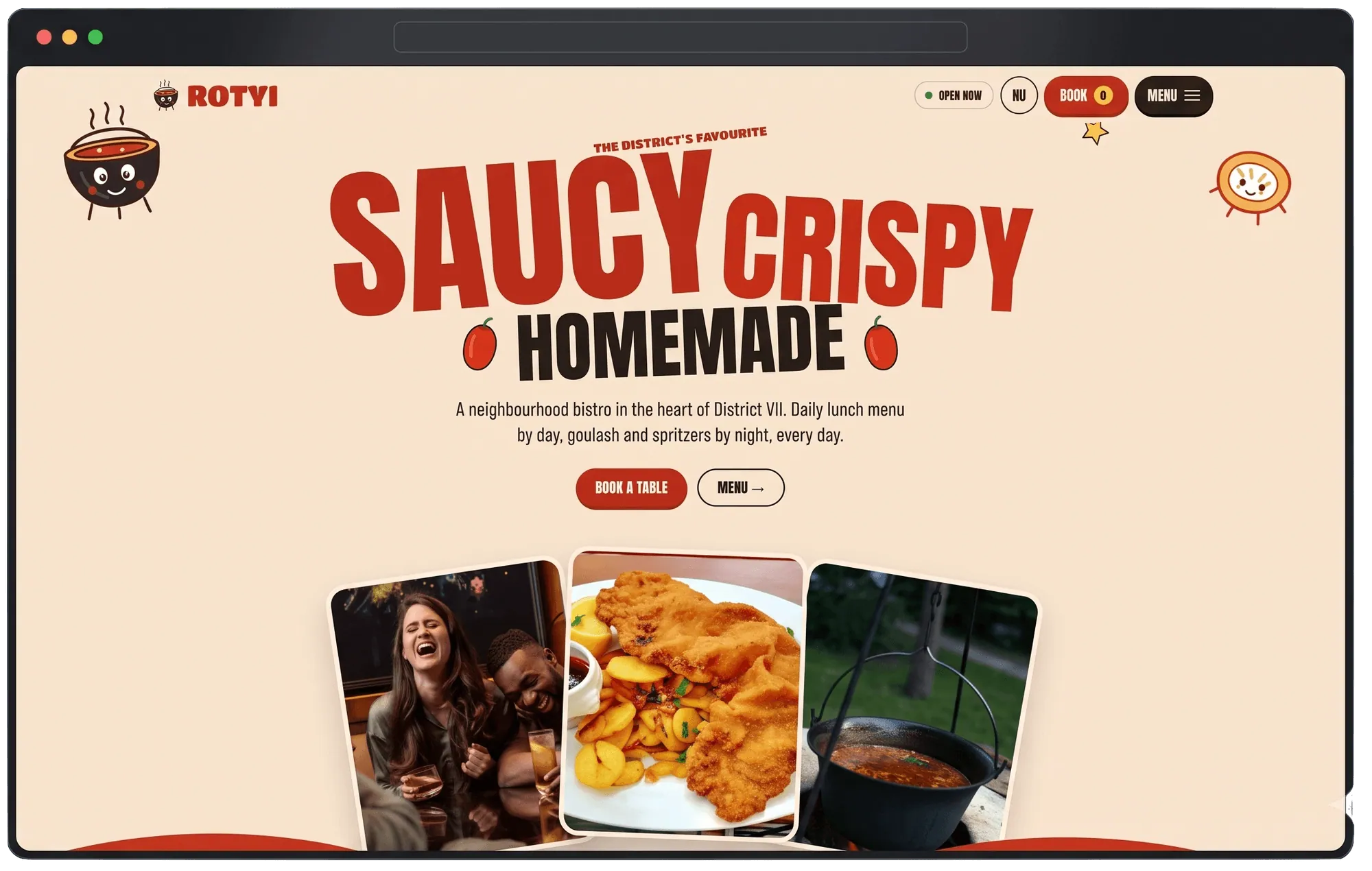
Rotyi Bistro: a menu that gets out of its own way
Small kitchens live on Instagram, but their websites are often a PDF nobody opens. We wanted to see what happens when the website works as hard as the Instagram feed does.
Oct 16, 2026 · 5 min read
Case notes
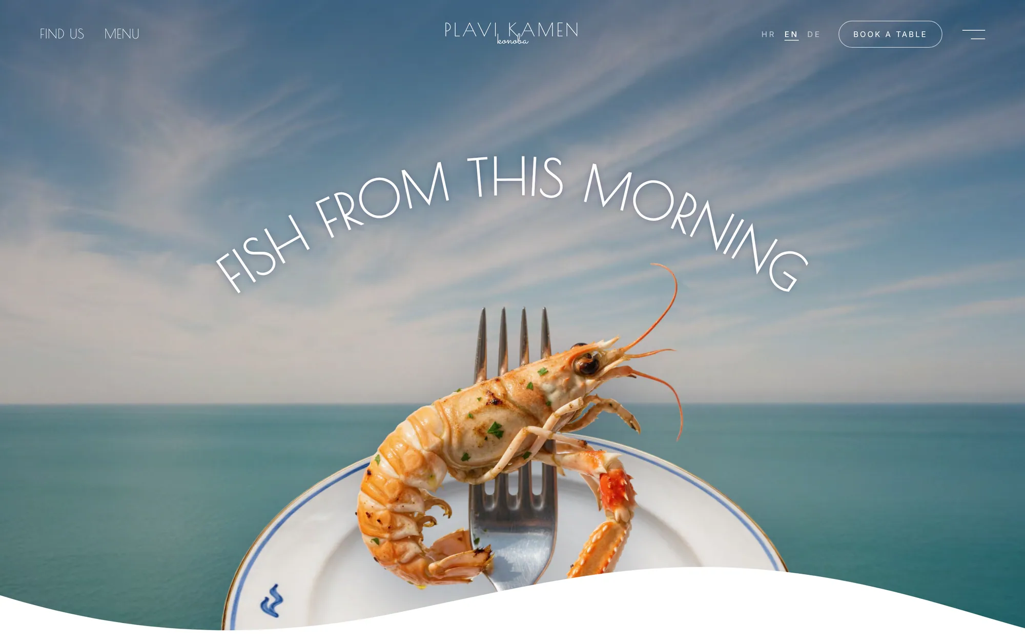
Konoba Plavi Kamen: designing for tourists who haven't arrived yet
Coastal hospitality has a timing problem most restaurant sites ignore — the decision to eat somewhere happens before anyone is in the room. Here's how we built around that.
Oct 14, 2026 · 6 min read
Growth
Reading a Search Console Links report without panicking
A sudden list of unfamiliar domains linking to your site looks alarming in Google Search Console. Most of the time it isn't — but you do need to be able to explain every one of them. Here's how we actually read that report.
Oct 20, 2026 · 6 min read